Au Revoir: 2019-2021 In Colors & Those Cute Umbrella sets

Not only is May 4th Star Wars Day, it’s also when Stampin’ Up’s 2021-2022 Annual Catalog will debut. Unfortunately, a new catalog means retiring product, and one of those products is the 2019-2021 In Color collection. As we bid adieu to these colors, I have a set of cards to share with you that feature these outgoing colors in addition to the Under My Umbrella and Pretty Parasol stamps sets, also both retiring. Don’t miss out on these Last Chance Products, some of which are on sale right now. When they’re gone, they’re gone, as they say.

The 2019-2021 In Colors were:

DISCLAIMER: These designs are adaptions of cards I’ve seen on Pinterest and other areas of the web. I’ll try to acknowledge my sources when possible.
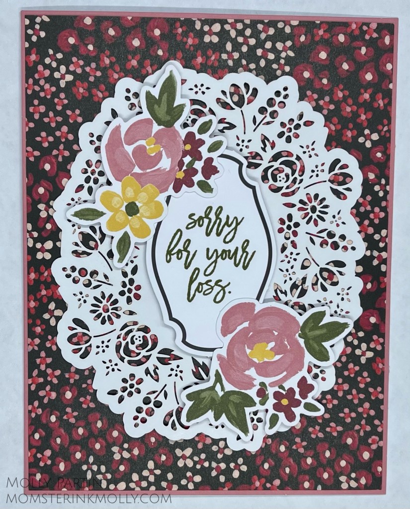
Rococo Rose

This card is an almost exact replica of this card by Sharon Burkert. All I did was change up the colors using the 2019-2021 Designer Series Paper Pack.
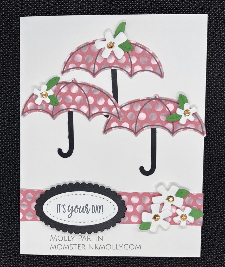
Terra Cotta Tile

This is one of those cards that I don’t remember where I found my inspirational jumping off point. I used the Ornate Garden DSP for both the umbrella and the background layer.

Pretty Peacock

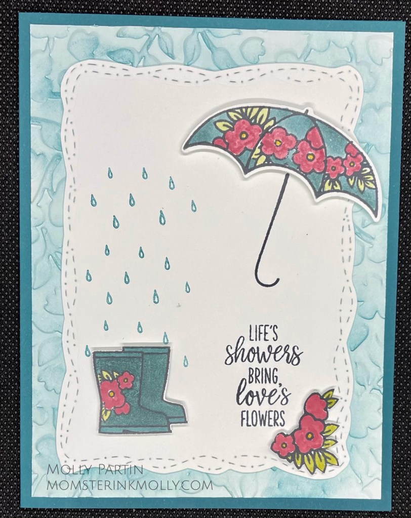
Pretty Peacock and Seaside Spray tied for my favorite colors from this collection. My creation is based on a darling yellow version of this card by Cindy Fodor. I used the Ornate Floral embossing folder for the background layer and the Stitched With Whimsy dies. The images are colored with Stampin’ Blends.
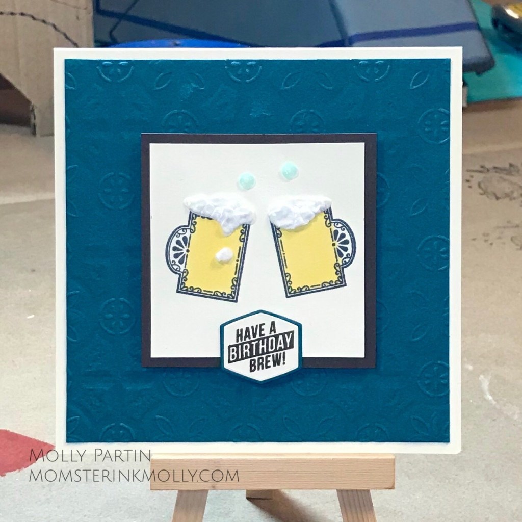
Seaside Spray

I couldn’t help myself from changing the black and white umbrellas on this card to Seaside Spray. I added in a smidge of one of the 2020-2022 In Colors, Misty Moonlight to two of the umbrellas.

Purple Posy

This Purple Posy card is an adaptation of this card by Kathryn Ruddick at katlodesigns.com. The background paper for this card is from the Playing With Patterns suite.

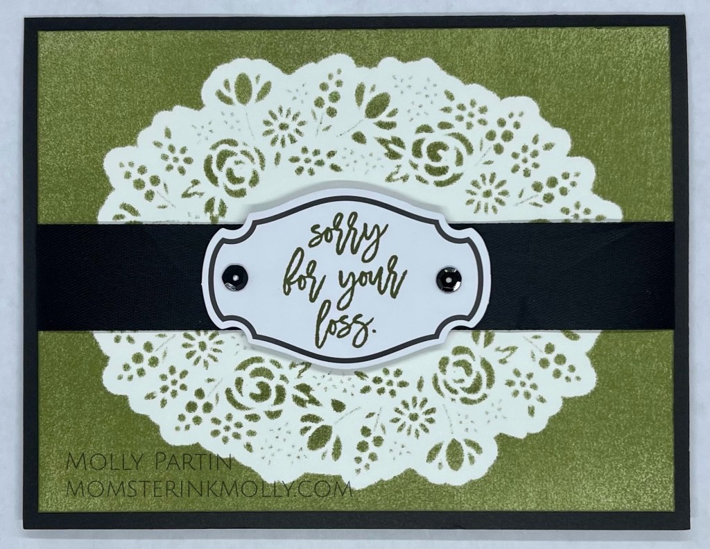
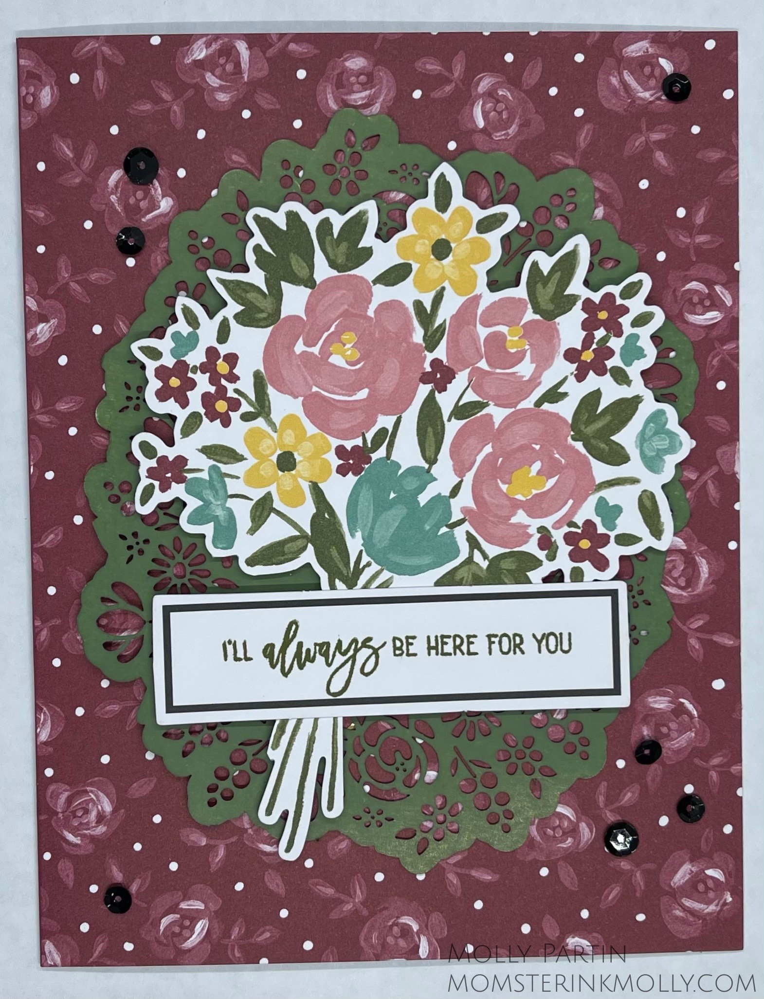
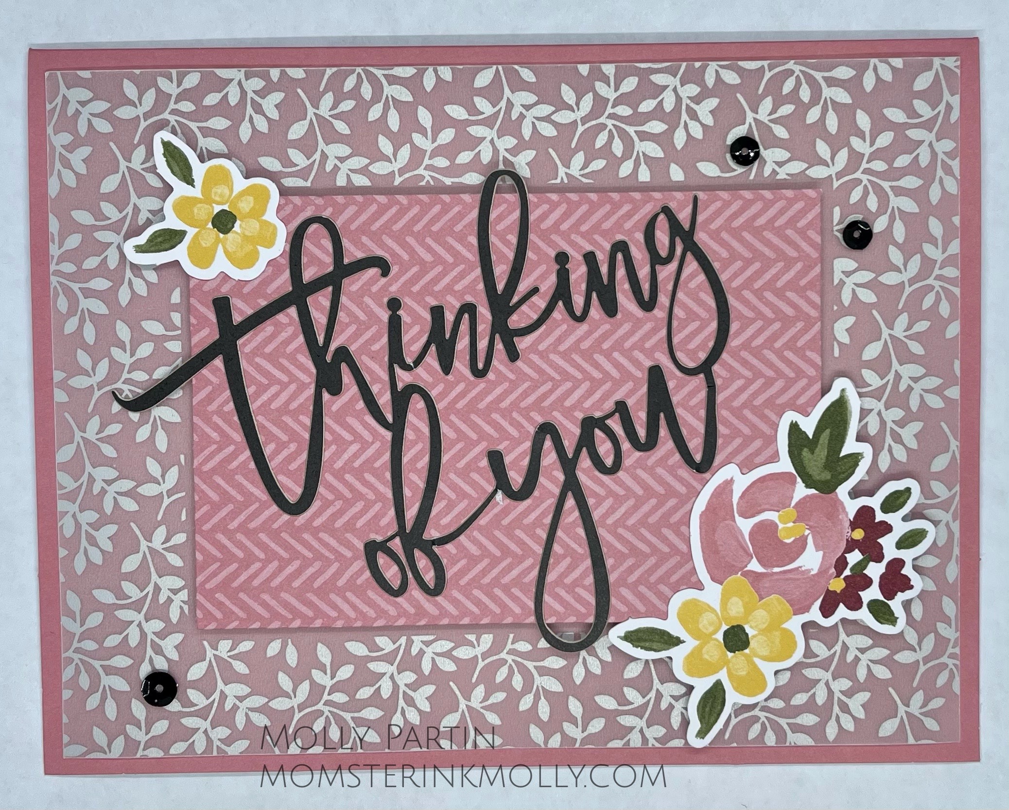
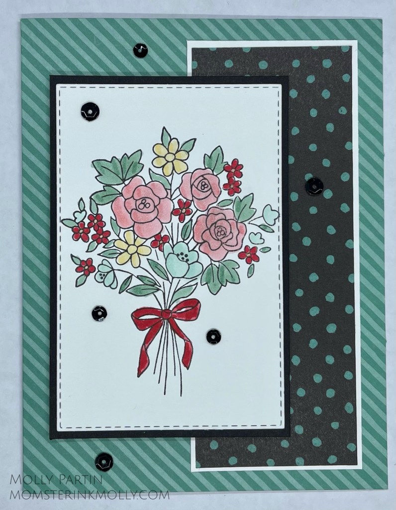
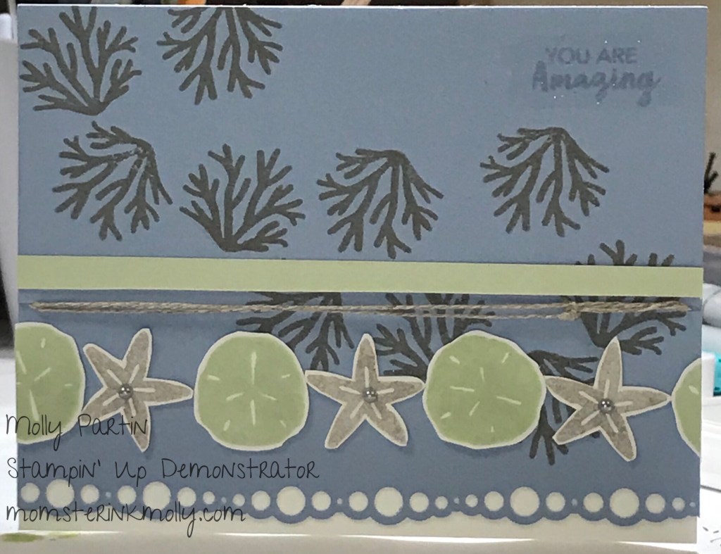
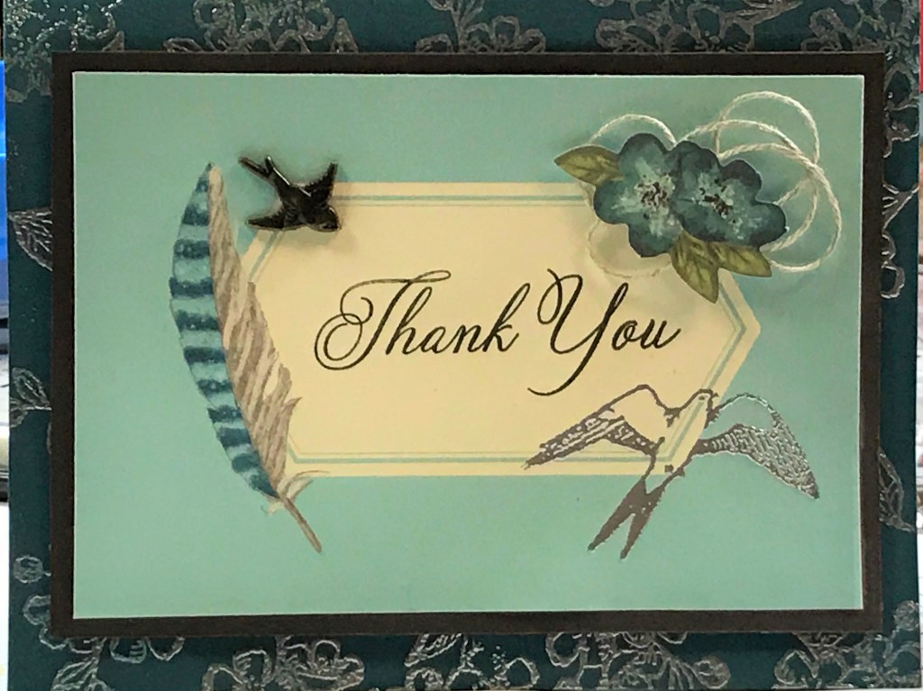
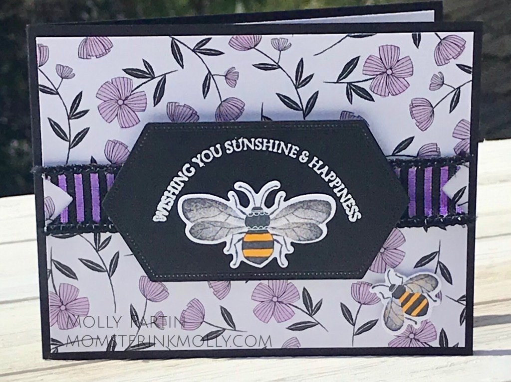
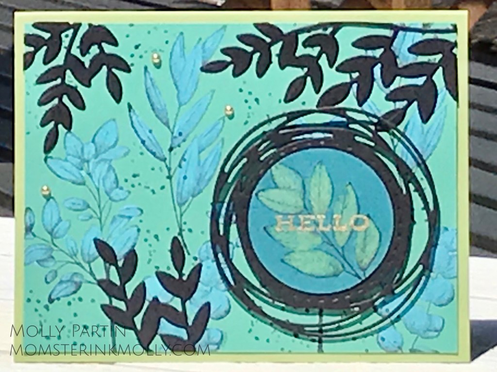
Here’s a slideshow of other cards I have previously made that feature the 2019-2021 In Color collection. I’m sad to see these colors retire, especially Pretty Peacock and Seaside Spray, but I’m excited to see the debut of the 2021-2023 In Colors on May 4th, aka Star Wars Day.

Retiring Stamp Sets, Coordinating Punch, & In Color Product List

February 2021 Paper Pumpkin: Bouquet of Hope

Deep confession: I don’t really like this kit. Not at all. It’s not the stamp set that bothers me, it’s the cards. They remind me too much of Mrs. Walowitz’s house on the Big Bang Theory with too many floral patterns clashing with one another. The fact that this kit doesn’t float my boat doesn’t make me angry and is only mildly disappointing. Stampin’ Up can’t please everyone all of the time.

The February Paper Pumpkin, Bouquet of Hope, includes all the supplies to create the cards pictured above, a Mossy Meadow mini inkpad, and the stamp set pictured below:

When I receive a kit that I’m not keen on, and after processing my the initial dislike, I bolster myself with two positive ideas. Sometimes a kit may not suit my tastes, but it there’s probably someone in my life who will find it perfectly perfect and enjoy the card as is. Secondly, I’ve been given an opportunity to practice creativity and transform the elements into something completely different than the original projects.

To begin this creative process I mentally deconstruct the cards and sort the supplies into two categories.

Things I liked:

  • Stamp set
  • Black Sequins
  • Mossy Meadow
  • Tags with black accent
  • Thinking of You sticker
  • Envelope lining

Things I didn’t like:

  • Rococo Rose
  • Gold Doily
  • Gold
  • Vellum (its tricky to attach without the glue showing through)
  • Too many flowers

The first thing I did was try and figure out what to do with that crazy gold doily. I put washi tape on the gold side of the doily and taped it to the center of a 5.25″ x 4″ sheet of white paper, thereby creating a mask. I sponged on Mossy Meadow ink, entirely covering both the doily and the white paper. I carefully removed the doily and set it aside for a different card.

Next, I added some 7/8″ black ribbon and used the sequins on the tag. By adding the thick ribbon and orienting the card in landscape vs. portrait direction, the tag doesn’t seem out of proportion from the doily.

Remember that Mossy Meadow doily I made earlier? I mounted it on the floral Merry Merlot card base. Instead of attaching the oval tag, I placed the large flower bouquet in the center, which reduced the busyness of the doily and was more appropriately portioned. I attached the I’ll always be here for you sentiment on the long horizontal tag to the bouquet, added some sequins, and voila, an improved card!

Vellum. I have a love/hate relationship with vellum. I love how it looks and I hate that it’s difficult to attach without adhesive showing through. In order to conceal the adhesive, you can only apply it behind parts of the card that are in front of the vellum. I felt that the card design in the kit didn’t have enough of these hidden areas to secure the vellum adequately. Instead, I adhered the Thinking of You sticker to a piece of patterned paper (reaped from one of the envelopes and one of the card bases), and mounted it in front of the vellum. On the Rococo Rose card, I flipped the vellum over so you saw white vines instead of gold. On the Just Jade card, I left the gold, because as much as I dislike gold color, I think it looks really cool paired with jade.

In my efforts to change the look of this kit, I ended up making nine different cards. Here’s a slideshow of the ones I didn’t feature in this post.